filter declaration so you can apply the same effect live in your stylesheet.Reaching for Photoshop or Lightroom for a quick photo tweak is overkill when all you need is a brightness boost, a sepia tint, or a quick fade for a blog header. Mobile apps like Snapseed and VSCO solve this on phones; the equivalent for desktop work is a browser tool with the same set of named effects. CSS specifies all the basic image filters — brightness(), contrast(), saturate(), blur(), sepia(), grayscale(), hue-rotate(), invert(), opacity(), drop-shadow() — and most browsers render them at GPU speed.
Our image filter tool exposes every CSS filter as a slider plus 24 prebuilt presets (vintage, cool, warm, fade, sepia, B&W, dramatic, polaroid, and more). Drop an image, drag sliders or click a preset, export the filtered image as PNG/JPG/WebP. The tool also outputs the equivalent CSS filter: declaration — useful when you want to apply the filter in CSS (live, no rendered file) instead of baking it into the image. This guide explains every filter, the preset presets, and the gotchas with hue-rotate and saturate that produce unexpected results.
All 10 CSS filter functions
| Filter | Range | What it does |
|---|---|---|
brightness(0–2) |
0% to 200%+ | Linearly scales the intensity of every pixel |
contrast(0–2) |
0% to 200%+ | Spreads pixel values away from mid-grey |
saturate(0–2) |
0% to 200%+ | 0% = grayscale; 200% = oversaturated |
grayscale(0–1) |
0% to 100% | Mixes original and luminance-only versions |
sepia(0–1) |
0% to 100% | Brown-tinted aging effect |
hue-rotate(0–360deg) |
0° to 360° | Spins all colours around the colour wheel |
invert(0–1) |
0% to 100% | Inverts pixel values (negative effect) |
blur(0–20px) |
0px to 20px+ | Gaussian blur — soften details |
opacity(0–1) |
0% to 100% | Fade entire image to transparent |
drop-shadow() |
x / y / blur / colour | Shadow that follows non-rectangular silhouettes |
24 prebuilt presets — what each one does
Filters compose. Stacking contrast(110%) saturate(140%) sepia(20%) produces the “Polaroid” look. Our presets are tuned versions of those compositions:
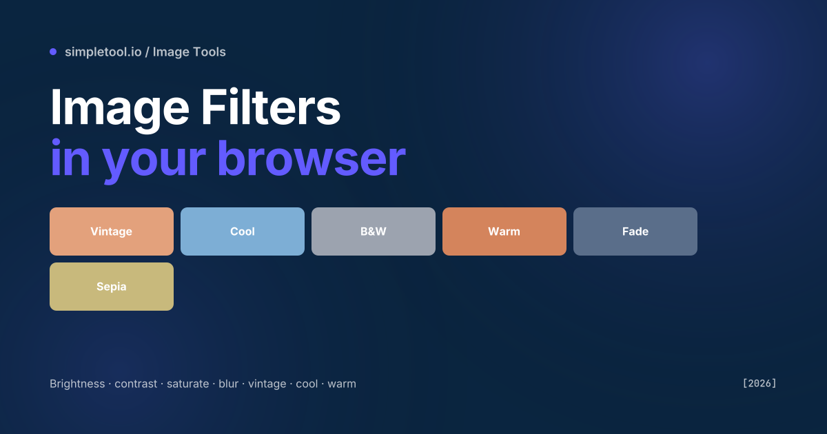
- Vintage: warm sepia with reduced saturation and slight contrast boost — instagram circa 2012
- Cool: blue hue shift and increased contrast — winter photography
- Warm: orange/yellow tint and slight saturation — sunset feel
- B&W: grayscale with contrast boost — photojournalism look
- Fade: reduced saturation and contrast — film fade
- Sepia: classic 100% sepia tint
- Polaroid: warm tint, soft contrast, slight grain
- Dramatic: high contrast + saturation
- Forest: green-shifted hue + saturation
- Sunset: orange-shifted hue + warm tint
- Night: deep blue + reduced brightness
- Lo-fi: pixel-soft blur + saturation
- … 12 more available in the dropdown
How to filter an image in your browser
- Open the image filter tool
- Drop an image (JPG, PNG, WebP, HEIC supported)
- Click a preset to apply, or drag individual filter sliders
- Watch the live preview update — every change is canvas-rendered in real time
- Click Export for PNG/JPG/WebP at 1× / 2× / 4× resolution
- Or click Copy CSS to copy the equivalent
filter:declaration for live styling
CSS filter vs baked-in filter — when to pick which
Two output options matter for different workflows:
- Bake into image: the filter is applied to the pixels, the image is exported as PNG/JPG. Use when you’re publishing to a CMS, social media, or anywhere the image lives independently of styling. The filter is permanent.
- Copy as CSS: the original image stays untouched and you apply the filter via
img { filter: contrast(120%) saturate(110%); }in your stylesheet. Use when you want one source image to render different ways across themes (light/dark mode, hover states, etc.). The filter is reversible — change the CSS and the image looks different without re-uploading.
For a photo gallery with hover effects, use CSS. For an image you’ll embed in a tweet or attach to an email, bake it in.
Common gotchas
- Hue-rotate isn’t perceptually uniform. Rotating hue by 60° shifts red to yellow, but the same 60° shift from blue lands in purple — the wheel isn’t uniform. Use the visual preview, don’t pick angles by intuition.
- Brightness above 100% can clip highlights. Once a pixel hits #FFFFFF it stops getting brighter, and details in the highlights are lost forever. Pull contrast down before pushing brightness up if you want to preserve detail.
- Blur slows older devices. Gaussian blur with radius >10px on a 4000×3000 image can briefly stall the page on a 5-year-old mobile. Resize the image first if performance matters.
- Grayscale isn’t desaturate.
grayscale(100%)uses Rec. 709 luminance weights (red 21%, green 72%, blue 7%);saturate(0)uses an HSL-style desaturation. The two produce subtly different greys for the same input. - Drop-shadow follows transparency. Unlike
box-shadow,drop-shadow()respects PNG alpha channels — perfect for product photos with transparent backgrounds. JPEG inputs don’t have alpha, so the shadow shows the rectangular outline. - Sepia at 100% destroys colour information. Once an image is fully sepia-toned, you can’t recover the original colours from the output. Always keep your original — bake the filter into a copy.
When NOT to use this tool
For photography retouching (skin smoothing, dodge/burn, layered adjustments), use Lightroom, Photoshop, or Affinity Photo — CSS filters can’t do localised edits. For colour grading a video sequence, use a video editor with proper LUT support (DaVinci Resolve, Premiere). For batch processing 100s of files, install sharp or ImageMagick and write a script — much faster than running each through a browser tool. For HDR or 16-bit colour work, browsers run filters in 8-bit RGB and can lose precision.
Frequently asked questions
Does this support PNG alpha channels?
Yes. PNG transparency is preserved through every filter. Drop-shadow specifically follows the alpha channel — useful for product photos on transparent backgrounds. JPEG inputs don’t have alpha; everything outside the photo is treated as fully opaque.
Can I export to WebP?
Yes — the export menu offers PNG (lossless, alpha), JPG (lossy, no alpha), and WebP (modern compression, alpha supported). Pick PNG for graphics with transparency, JPG for photos, WebP for the smallest file when modern browser support is acceptable.
Will the filtered output match what I see in CSS?
Yes — we use the same canvas filter API browsers use for the CSS filter property, so the rendered output is byte-identical to what your stylesheet would produce on a browser of the same version. Older browsers may render slight differences in blur kernels.
Can I apply multiple filters at once?
Yes — every slider is independent and they all stack. The preview shows the cumulative effect; the exported CSS lists each filter in order (filter: brightness(110%) contrast(120%) sepia(20%)). The order matters slightly — earlier filters are applied first.
Is my image uploaded?
No. The tool runs canvas filters in your browser. The image is loaded into a blob URL and processed locally — never uploaded.
What’s the resolution limit?
Effectively your browser’s available canvas memory. Desktop browsers handle 8000×6000 (48 MP) images comfortably; mobile is more limited (around 4000×3000). Heavy filters like blur slow down on large inputs — resize first if you don’t need full resolution.
Related tools and guides