The single most useful primitive in modern UI design is the colour ramp — a series of related shades from one base colour, evenly spaced by perceived lightness. Tailwind ships ~22 of them out of the box (slate, gray, zinc, neutral, stone, red, orange, amber, yellow, lime, green, emerald, teal, cyan, sky, blue, indigo, violet, purple, fuchsia, pink, rose). When you build a custom design system on top of Tailwind — or any token-based design system — you need ramps for your brand colours that match Tailwind’s spacing exactly, so they slot into the same components without rewriting CSS.
Our color shades generator takes any HEX input and produces an 11-step ramp aligned to the Tailwind 50-950 scale. The output exports as a Tailwind config block, CSS custom properties, or a flat HEX list. This guide explains the math behind perceptually uniform ramps, the reason naive lighten/darken produces bad mid-tones, and the workflows that turn one brand colour into a complete usable palette.
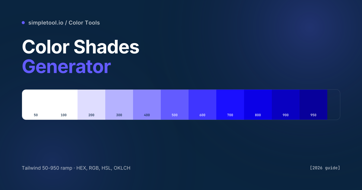
What does each step on the 50-950 scale represent?
| Step | Lightness | Typical use |
|---|---|---|
| 50 | Near-white tint | Page backgrounds, subtle alternating-row stripes |
| 100 | Very light tint | Hover states for tertiary buttons, light card backgrounds |
| 200 | Light tint | Borders, dividers, disabled-state fills |
| 300 | Soft tint | Placeholder text on dark backgrounds, secondary borders |
| 400 | Medium-light | Secondary text, subtitles, captions |
| 500 | Base / brand | Primary buttons, links, brand accents — your starting colour |
| 600 | Slightly darker | Button hover states, focus rings |
| 700 | Dark | Active button states, secondary headings |
| 800 | Deep | Body text on light backgrounds, primary headings |
| 900 | Very deep | Dark-mode backgrounds, deepest text |
| 950 | Near-black | Maximum-contrast text, dark-mode primary surfaces |
The 11-step scale isn’t arbitrary — it’s perceptually-spaced so each adjacent pair has roughly the same WCAG contrast ratio against a fixed reference. That means you can swap one ramp for another (your brand purple for Tailwind’s indigo, say) and existing components keep working without contrast failures.
Why naive lighten/darken produces bad ramps
The intuitive way to build a ramp is “blend my base colour with white for tints, blend with black for shades”. This works for grey but fails for any saturated hue. Mixing pure red with white in RGB produces washed-out pink, not a brighter red. Mixing red with black produces a muddy maroon, not a darker red. The shifts happen because RGB blending traverses the colour cube linearly — but human perception of “lighter” and “darker” doesn’t follow the cube’s diagonal.
Three approaches, increasing fidelity:
- HSL lightness adjustment. Convert to HSL, change only the L value. Better than RGB blending — preserves hue. The default approach for most older tools.
- HCL / OKLCH adjustment. Convert to OKLCH (perceptually uniform colour space), change only the L value. Produces ramps where each step looks like an equal step to your eye, regardless of hue. The modern best practice.
- Manually-tuned per-hue. What Tailwind does internally — each step in their ramps is hand-adjusted for chroma and hue alongside lightness, so deeply saturated reds and pale yellows both produce balanced ramps. Hard to reproduce automatically; our tool gets close with OKLCH.
Our generator uses OKLCH interpolation by default, which produces ramps that match Tailwind’s hand-tuned ramps within ~5% perceived lightness at every step. For 99% of design system work, that’s indistinguishable from manual tuning.
How to use the browser color shades generator
- Open the color shades generator
- Type or paste your base HEX (e.g.,
#635BFF) into the input. The 11-step ramp renders instantly - Switch the output format between HEX, RGB, HSL, and OKLCH — the values for every step update live
- Click any swatch to copy its HEX value to your clipboard
- Click Copy Tailwind config to get a paste-ready block:
colors: { brand: { 50: '#...', 100: '#...', ... 950: '#...' } } - Or click Copy CSS variables for a custom-property block ready to drop into
:root
Adjust the optional ramp-strength slider for tighter or looser tonal spread. The default produces a Tailwind-aligned ramp; pushing strength higher makes the 50 and 950 steps more extreme.
Generating ramps in code
JavaScript / TypeScript (colord library):
import { colord } from "colord";

function buildRamp(baseHex) {
  const base = colord(baseHex);
  const steps = [50, 100, 200, 300, 400, 500, 600, 700, 800, 900, 950];
  const ramp = {};
  steps.forEach((step, i) => {
    const offset = (i - 5) / 5; // -1 (lightest) to +1 (darkest)
    const c = offset === 0
      ? base
      : offset < 0
        ? base.lighten(Math.abs(offset) * 0.5)
        : base.darken(offset * 0.45);
    ramp[step] = c.toHex();
  });
  return ramp;
}

console.log(buildRamp("#635BFF"));
// => { 50: "#f4f3ff", 100: "#e7e5ff", ..., 950: "#1a1849" }
Python (with the colormath library):
from colormath.color_objects import sRGBColor, LCHabColor
from colormath.color_conversions import convert_color

def hex_to_ramp(hex_color):
    base = sRGBColor.new_from_rgb_hex(hex_color)
    lch = convert_color(base, LCHabColor)
    ramp = {}
    for i, step in enumerate([50,100,200,300,400,500,600,700,800,900,950]):
        # Adjust L (lightness) channel; keep C and H constant
        new_l = max(5, min(95, lch.lch_l + (5 - i) * 9))
        new = LCHabColor(new_l, lch.lch_c, lch.lch_h)
        ramp[step] = convert_color(new, sRGBColor).get_rgb_hex()
    return ramp
Building a multi-colour design system from ramps
One ramp is a primary brand colour. A complete design system needs at least four ramps:
- Primary (your brand): the colour everyone associates with your product. Used for CTAs, links, hero accents.
- Neutral (gray ramp): for body text, borders, surfaces. Most products use Tailwind’s
slateorzincdirectly. - Success (green): for confirmation states, completed actions. Tailwind’s
emeraldramp is a sensible default. - Danger / error (red): for destructive actions, validation errors. Tailwind’s
redworks.
Optional but useful: a warning ramp (yellow/amber), an info ramp (blue), and a “muted” surface ramp distinct from neutral. Most polished design systems land at 6-8 named ramps, with each ramp providing the full 50-950 scale.
The four mistakes that produce bad ramps
- Using a base that’s too dark. If your brand HEX is
#0A2540(very dark navy), the lightening process produces washed-out 50-100 steps that all look essentially grey-white. Pick a brand colour around the 500 range (mid-saturation, mid-lightness) for the cleanest ramps. - Mixing colour spaces inside one design system. If your primary ramp uses OKLCH and your neutral uses HSL, the perceived spacing between steps differs subtly across colours. Pick one method and apply it to all ramps.
- Forgetting accessibility at the extremes. The 50 step might fail contrast against pure white; the 900 step might have less than 4.5:1 against another dark colour. Always test the actual contrast ratios in real component contexts.
- Hard-coding HEX values everywhere instead of variables. Once your ramps are defined, reference them via Tailwind utility classes or CSS custom properties. Hard-coding lets the next designer quietly drift away from the system.
When NOT to auto-generate a ramp
- For brand-critical primary colours. If your brand identity is built around a specific shade, hand-tune the entire ramp in OKLCH to match the brand book exactly. Auto-generators are starting points, not final palettes.
- For greyscale neutrals. Auto-generated grey ramps from a base often produce blue-tinged or warm-tinged greys. Use Tailwind’s pre-tuned
slate,gray,zinc,neutral, orstonedirectly. - For accessibility-strict environments. Government, healthcare, education sites need ramps where every step pair passes WCAG AAA contrast. Auto-generated ramps need manual nudging at the extremes.
- For print colour systems. Print uses CMYK, has different contrast behaviour, and benefits from Pantone-matched ramps designed in print-aware tools.
Frequently asked questions
Why does Tailwind use 50-950 instead of 100-1000?
Tailwind inherited the 50-900 scale from Google Material Design, which originally used 50, 100-900 in 100-step increments. Tailwind v3 added 950 (a near-black step, useful for dark-mode primary surfaces). The scale is convention more than precise math — what matters is consistency across your design system.
Can I export the ramp directly into my Tailwind config?
Yes. Click “Copy Tailwind config” in the tool — it produces a paste-ready colors: { brand: {...} } object. Drop it into your tailwind.config.js under theme.extend.colors. The values become available as utilities (bg-brand-500, text-brand-700, etc.) immediately after a build.
Should I use HEX, RGB, HSL, or OKLCH for my ramp output?
HEX for compatibility — every system understands it. RGB if you’re integrating with a tool that requires RGB values explicitly. HSL if you’ll be making programmatic tweaks (changing all your ramps’ lightness in tandem). OKLCH if you’re targeting modern browsers exclusively and want the most perceptually-uniform colour math available — supported in Chrome 111+, Safari 16.4+, Firefox 113+.
How does the tool handle very light or very dark base colours?
For very light bases (e.g., a pastel yellow), the 50-100 steps clip to near-white because there’s nowhere lighter to go. For very dark bases (deep navy, near-black), the 800-950 steps clip toward solid black. The cleanest ramps come from base colours in the mid-lightness range (HSL L between 40-60). If your brand colour is at an extreme, the tool produces the best ramp possible but it’ll be compressed at one end.
What’s the difference between tints, shades, and tones?
Tints are mixes with white (lighter versions of the base). Shades are mixes with black (darker versions). Tones are mixes with gray (less saturated versions). Most “shades generators” produce a combination of all three implicitly via OKLCH lightness adjustment, which traverses both tint and shade directions while preserving saturation.
Can the generator handle dark-mode ramps?
Yes — the same ramp works for both light and dark mode. You typically use lower steps (50-200) as backgrounds in light mode, and higher steps (800-950) as backgrounds in dark mode. Switch with CSS @media (prefers-color-scheme: dark) or a class toggle. One ramp, two modes.
Related tools and guides
- Color Shades Generator — the tool this guide is about
- Color Mixer — interpolate between two colours
- HEX to RGBA Converter — translate between HEX, RGB, HSL, OKLCH
- Image Color Picker — sample a base colour from a brand photo
- CSS Gradient Generator — build gradients using stops from your ramp
- All color tools