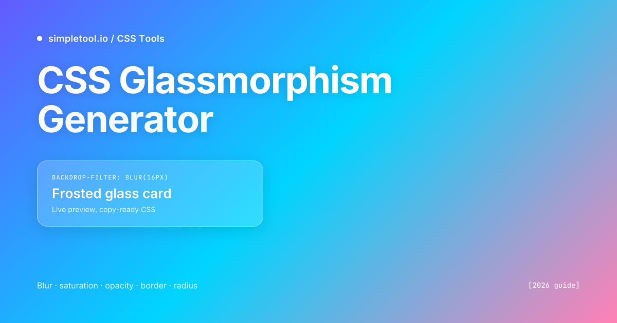
backdrop-filter: blur() over a semi-transparent background. The five properties that matter: blur (12-20px), saturation (130-160%), background opacity (15-30%), border opacity (25-40%), border radius (12-20px). Our live generator ships copy-ready CSS with the -webkit- prefix included for Safari.Glassmorphism is the design language of macOS Big Sur, the iOS Control Center, the Apple Vision Pro interface, and roughly half of the SaaS landing pages shipped since 2021. The look is unmistakable: a frosted card hovering over a colourful or photographic background, with content behind softened to a pleasant blur. Used well, it adds depth and hierarchy without the visual weight of a solid card; used badly, it produces low-contrast text that fails accessibility audits and tanks your Lighthouse performance score.
Our CSS Glassmorphism Generator gives you sliders for the five properties that actually drive the effect — blur, saturation, background opacity, border opacity, border radius — over four backdrop presets (aurora gradient, sunset, ocean, photographic). Tweak until you like the result, copy the generated CSS, paste into your stylesheet. This guide explains what each property does, when glassmorphism is the right design choice, and the mistakes that turn frosted glass into muddy plastic.
What does the glassmorphism effect actually combine?
Glassmorphism isn’t a single CSS property — it’s a recipe. Five properties stacked together produce the effect, and removing any one of them breaks the illusion.
| Property | Purpose | Sweet spot |
|---|---|---|
backdrop-filter: blur() |
Blurs whatever’s behind the element | 12-20px (10px reads as soft focus, 30px+ reads as muddy) |
backdrop-filter: saturate() |
Boosts the colour intensity of the blurred backdrop | 130-160% (matches Apple’s HIG; 200%+ looks neon) |
background: rgba(255,255,255,0.X) |
Tints the glass white-ish so it’s visible | 0.15-0.30 alpha (under 0.10 looks invisible, over 0.40 loses the glass look) |
border: 1px solid rgba(255,255,255,0.X) |
Catches the light at the glass edge | 0.25-0.40 alpha (without it, the card has no defined boundary) |
border-radius |
Soft corners — glass is never sharp | 12-20px (16-20px reads premium; 4-8px feels too utilitarian) |
The non-obvious one is saturation. Without it, the blur alone produces a slightly washed-out result because blurring averages colour values toward neutral. Pulling saturation up to ~140% restores the colour intensity the blur removed and gives that vibrant frosted look you see on macOS. Drop saturation entirely and the effect becomes muted glass over a hospital-grey backdrop.
The minimal vanilla CSS produced by our generator looks like this:
.glass-card {
  background: rgba(255, 255, 255, 0.18);
  backdrop-filter: blur(16px) saturate(140%);
  -webkit-backdrop-filter: blur(16px) saturate(140%);
  border: 1px solid rgba(255, 255, 255, 0.3);
  border-radius: 16px;
}
The -webkit-backdrop-filter prefix is non-negotiable. Safari (including iOS Safari, which ~25% of mobile traffic uses) requires the prefixed property even in 2026. Without it, the effect silently fails on iPhone and iPad — your card looks fine on the simulator and broken on the actual device.
Browser support — what works in 2026
The backdrop-filter property has roughly 95% global browser support as of 2026. The only mainstream blocker is older Firefox versions (pre-103, released August 2022) where the property is disabled by default. Anyone on a modern browser sees the effect; anyone on an older browser sees a degraded fallback.
| Browser | Required version | Notes |
|---|---|---|
| Chrome / Edge | 76+ | No prefix needed, full support since 2019 |
| Safari (desktop + iOS) | 9+ (with -webkit- prefix) |
Always include the prefix; non-prefixed version isn’t recognised |
| Firefox | 103+ | Pre-103 silently degrades — provide a fallback |
| Samsung Internet | 12+ | Common on Android; works without prefix |
The right fallback is a slightly more opaque background and no blur. Browsers that don’t recognise backdrop-filter simply ignore the property — meaning your background: rgba(255,255,255,0.18) looks like a flat semi-transparent white card. Nudge the alpha up to 0.40 inside an @supports not rule for those browsers:
@supports not (backdrop-filter: blur(1px)) {
  .glass-card {
    background: rgba(255, 255, 255, 0.40);
  }
}
How to use the browser tool
- Open the CSS Glassmorphism Generator
- Pick a backdrop preset (Aurora, Sunset, Ocean, Photo) — the photo backdrop is the truest test because real photographs vary in colour and contrast across the area
- Drag the five sliders: blur, saturation, background opacity, border opacity, border radius. The preview updates instantly
- Aim for a card that’s clearly visible against any part of the backdrop. If you can’t read the preview text comfortably, the effect is too transparent for production
- Click Copy CSS — the output includes the
-webkit-prefix automatically - Paste into your stylesheet, attach the class to a card with
position: relative, and verify on at least one mobile device
The Photo preset is intentionally aggressive. If your design holds up over a real photograph, it’ll hold up over almost any backdrop you throw at it later. Designs that only work over a smooth gradient tend to fall apart the moment a real product image, hero photo, or background-image asset takes its place.
Glassmorphism in popular CSS frameworks
Tailwind CSS (with custom utilities or arbitrary values):
<div class="rounded-2xl border border-white/30
            bg-white/[0.18] backdrop-blur-xl backdrop-saturate-150
            p-6">
  Frosted glass card
</div>
styled-components / Emotion:
const GlassCard = styled.div`
  background: rgba(255, 255, 255, 0.18);
  backdrop-filter: blur(16px) saturate(140%);
  -webkit-backdrop-filter: blur(16px) saturate(140%);
  border: 1px solid rgba(255, 255, 255, 0.3);
  border-radius: 16px;
  padding: 1.5rem;
`;
Vue / React inline style (when CSS-in-JS isn’t an option):
<div style={{
  background: "rgba(255, 255, 255, 0.18)",
  backdropFilter: "blur(16px) saturate(140%)",
  WebkitBackdropFilter: "blur(16px) saturate(140%)",
  border: "1px solid rgba(255, 255, 255, 0.3)",
  borderRadius: 16,
}} />
For Tailwind specifically, the built-in backdrop-blur-* and backdrop-saturate-* utilities map to the underlying CSS perfectly — but the prefixed version isn’t auto-included. Tailwind v3.3+ adds -webkit-backdrop-filter via Autoprefixer if you have the right PostCSS config. If you’re using Tailwind without Autoprefixer (older versions or non-default configs), add the prefix manually for production.
Light theme vs dark theme — different tuning required
Glassmorphism behaves very differently in light and dark themes, and a card tuned to look perfect on a light background frequently fails on a dark one (and vice versa). The reason: the white-tinted background you set with rgba(255,255,255,0.X) reads as bright over dark backdrops and disappears over light ones.
- Light theme: use
rgba(255, 255, 255, 0.20)background with a darker text colour (your brand navy works). Blur 16-20px reads as crisp. - Dark theme: swap to
rgba(255, 255, 255, 0.08)background — much lower alpha — with white text. Blur 12-16px is enough; more reads as washed out. - For dynamic theming (system preference, user toggle), define the alpha as a CSS variable:
background: rgba(255,255,255, var(--glass-alpha))and switch the variable in your dark-mode media query.
The Apple HIG guidance — which is where most modern glassmorphism design originates — handles this by using system materials rather than fixed RGBA values. CSS doesn’t expose system materials directly, but the variable-based approach above approximates the same idea.
Performance — when NOT to use glassmorphism
The backdrop-filter property is computed on the GPU and is meaningfully expensive. A single small glass card on a hero section is free; ten of them on a feed-style listing produces visible jank on mid-range devices. The cost scales with two things: how large the blurred area is, and how often you change anything that triggers a recomposite.
- Don’t apply backdrop-filter to large viewport-spanning elements. A glassmorphic header bar across the full viewport width is visibly slow to scroll on Android phones from before 2022. Limit to elements under ~600px in either dimension.
- Don’t animate
backdrop-filter. Animating the blur radius forces the GPU to recompute the entire blurred area every frame — typically 30-60 dropped frames per animation. If you must animate, useopacityortransformon a parent instead. - Don’t stack multiple glass elements in a scroll container. A list of 20 glass cards is 20× the GPU work of one. For lists, use a single backdrop and solid card backgrounds inside it.
- Don’t use it where there’s nothing interesting behind. A glass card over a flat white page wastes GPU cycles producing an effect nobody can see. Glassmorphism only “earns its budget” over a varied backdrop — gradient, photo, animated background.
Profiling rule: load your page on a mid-range Android phone (Pixel 5a or equivalent), open Chrome DevTools’ Performance tab, record a scroll. If you see frame drops below 50fps anywhere a glass element is on screen, reduce the blur radius or shrink the glass area until smooth.
The five mistakes that ruin glassmorphism
- Forgetting the
-webkit-prefix. The most common production bug — works perfectly in your dev browser, broken on every iPhone visitor. Always ship both prefixed and unprefixed versions; use Autoprefixer in your build pipeline. - Background opacity too low. An alpha under 0.10 looks invisible against subtle backdrops — the card has no presence. Floor at 0.15 for light themes, 0.06 for dark themes.
- No border, or a too-subtle border. The border catches “light” from the backdrop and defines the glass edge. Without it, the card looks like a vague hazy patch. Always include
border: 1px solid rgba(255,255,255,0.25)minimum. - Sharp corners. Real glass is never perfectly sharp at typical UI scales. A 4-8px border radius reads as utilitarian / tacked-on. Go 12-20px for the premium look most designers want.
- Low-contrast text inside. A cardthat’s 18% opaque white doesn’t give you much background to read text against. Either bump the alpha to 0.30+ for light backdrops, or pair the glass card with a subtle dark gradient overlay where the text sits.
Accessibility — the contrast trap
The most common accessibility failure with glassmorphism: text that has 4.5:1 contrast against your “intended” background but only 2.8:1 against the actual rendered colour after the glass card averages with whatever’s behind it. WCAG audits flag the rendered contrast, not the design-tool contrast.
Two practical mitigations:
- Run a real audit. Lighthouse and axe-core both compute rendered contrast — they’ll tell you when a glass card’s text fails. Run on the actual production page, not just the design mockup.
- Reserve a darker text zone. Inside the glass card, add a subtle
background: rgba(0,0,0,0.10)behind text-heavy areas. The slight darkening pushes text contrast back into the 4.5:1+ range without breaking the glass aesthetic.
If your glassmorphic design only passes contrast in one specific theme or one specific page state, that’s a sign the design is too brittle for production — keep iterating until it holds up across light/dark and across the range of backdrops it’ll actually appear over.
When NOT to use glassmorphism at all
- Forms and dense data tables. Glass is decorative, not functional. Forms need maximum readability and clear input boundaries — a glass card around a 12-field signup form makes everything harder to read.
- Long-form reading content. Article body text wants high contrast and a stable background. Glass over a varying backdrop produces flickering perceived contrast as the user scrolls.
- Performance-critical pages. Marketing landing pages with a single glass hero card are fine. Internal dashboards rendering 100+ widgets with glass effects are slow on real-user devices.
- Anywhere accessibility is mandated. Government, healthcare, education, and finance sites face strict WCAG audits. The contrast complications of glassmorphism are easier to avoid than to mitigate.
- When the page has no interesting backdrop. Glass on plain white wastes GPU and adds nothing visual. Reach for it only when there’s a real backdrop to interact with.
Frequently asked questions
Why doesn’t my glassmorphism effect appear in Safari?
Safari requires the -webkit-backdrop-filter prefix in addition to the standard backdrop-filter. Without the prefix, Safari (including iOS Safari) silently ignores the property. Add both lines to your CSS — our generator outputs both automatically. If you’re using a build tool, configure Autoprefixer to handle this for you across all your CSS.
What’s the right blur amount for glassmorphism?
12-20 pixels is the sweet spot for most use cases. Below 10px reads as a soft focus rather than frosted glass. Above 25-30px loses the connection to whatever’s behind, which defeats the design purpose. Match the blur to the size of the card — small cards (under 200px wide) work fine at 12px, large cards (400px+) benefit from 18-20px.
Does glassmorphism hurt page performance?
Yes, measurably, when overused. Each glass element is computed on the GPU on every paint. One small glass card has zero noticeable cost; ten large glass elements in a scroll container produce visible jank on mid-range devices. Limit glassmorphism to hero areas and feature highlights, not feed-style listings or table rows.
Is glassmorphism still trendy in 2026?
Yes, particularly since Apple Vision Pro and the macOS Tahoe interface refresh kept the language alive. The technique has matured beyond the 2021 hype phase into a stable design pattern. Like any aesthetic choice, it’s only “trendy” if used thoughtlessly — applied with intent (over real backdrops, with attention to contrast and performance), it reads as polished and intentional rather than dated.
Can I use glassmorphism without a gradient or photo backdrop?
Technically yes, practically no. Glassmorphism only “works” when there’s something interesting behind to blur. Glass over a flat white page wastes GPU cycles producing an effect that’s invisible. If your page background is solid, switch to a different design approach (soft shadows, subtle colour tints) or add a gradient or texture before reaching for glass.
How do I make glassmorphism work on dark backgrounds?
Lower the background alpha — try rgba(255,255,255,0.06) instead of 0.18. The white tint reads much brighter against dark backdrops than against light ones, so a value tuned for light theme looks washed out on dark. Use a CSS variable for the alpha and switch its value in your dark-mode media query for clean dual-theme support.
Related tools and guides
- CSS Glassmorphism Generator — the tool this guide is about
- CSS Gradient Generator — for the colourful backdrops glass cards need
- CSS Box Shadow Generator — pair subtle shadows with glass for added depth
- CSS Border Radius Generator — for organic blob shapes underneath glass overlays
- HEX to RGBA Converter — for converting brand colours into the rgba() values glassmorphism needs
- All CSS tools — generators for gradients, shadows, clip paths, animations, and more