<input type="checkbox"> for accessibility — keyboard navigation, screen reader announcements, form-submit semantics — while letting you control every visual aspect. The technique uses appearance: none to strip the default style, then renders a custom check via ::before pseudo-element. Our free CSS checkbox generator ships 20+ presets (rounded, bordered, animated, brand-colored), custom check icons, and the indeterminate state.HTML checkboxes look the same on every site by default — and every site replaces them. Bootstrap, Tailwind UI, Material Design, every CMS, every shadcn-ui clone has a custom checkbox component. The challenge isn’t visual — it’s keeping the accessibility intact while restyling. A custom div-based checkbox loses keyboard support, form submission, screen-reader announcements, and pointer-events behaviour. The trick: keep the native <input> for accessibility, hide it visually, and style a sibling element that responds to its state.
Our CSS checkbox generator outputs the canonical pattern: a hidden native input + an associated label with a custom-styled box. Keyboard Space still toggles, Tab still navigates, screen readers still announce “checkbox, checked”, and the form still submits the value. This guide explains the accessibility-preserving CSS pattern, the gotchas with :focus-visible rings, and how to add the indeterminate state correctly.
The accessibility-preserving CSS pattern
The pattern uses appearance: none on the input to strip default OS styling, then customises every visual aspect with CSS — without losing the underlying <input>:
input[type="checkbox"] {
  appearance: none;
  -webkit-appearance: none;
  width: 24px;
  height: 24px;
  border: 2px solid #d0d5dd;
  border-radius: 6px;
  background: white;
  cursor: pointer;
  position: relative;
  transition: all 150ms ease;
}

input[type="checkbox"]:checked {
  background: #635BFF;
  border-color: #635BFF;
}

input[type="checkbox"]:checked::after {
  content: "";
  position: absolute;
  inset: 4px 6px;
  border-right: 2px solid white;
  border-bottom: 2px solid white;
  transform: rotate(45deg);
}

input[type="checkbox"]:focus-visible {
  outline: 2px solid #635BFF;
  outline-offset: 2px;
}
That’s it — a fully custom-styled checkbox with keyboard support, form support, and accessibility intact. The native <input> still receives focus, still toggles on space, still submits. appearance: none works in every modern browser since 2020.
Visual variations and presets
| Preset | Look | Best for |
|---|---|---|
| Rounded square | 8px corner radius (default in 2026 design) | Modern web apps |
| Sharp square | No radius | Brutalist or technical UIs |
| Circle | 50% radius — like a radio button | Soft, friendly UIs |
| Animated check | Stroke-dash animation on toggle | Premium feel |
| Material ripple | Tap-feedback ripple animation | Material Design apps |
| iOS-style | Filled fill on check | iOS-feel UIs |
How to generate a custom checkbox
- Open the CSS checkbox generator
- Pick a preset shape (rounded square, sharp, circle)
- Set border color, fill color, check icon style
- Toggle features: animation, ripple, indeterminate-state support, focus ring style
- Click Copy CSS for the production code (includes
:focus-visiblefor accessibility)
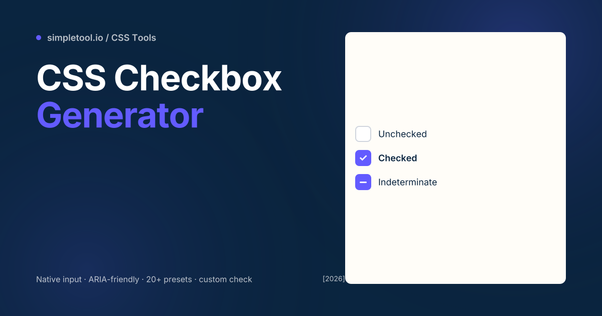
The indeterminate state — what most generators skip
HTML checkboxes have three states: unchecked, checked, and indeterminate. Indeterminate is set programmatically (via JavaScript: el.indeterminate = true;) and represents “partially selected” — common in tree views where a parent is partially-but-not-fully checked among children.
The CSS selector for indeterminate is :indeterminate. Our generator outputs a third visual state for it (typically a horizontal bar instead of a checkmark):
input[type="checkbox"]:indeterminate {
  background: #635BFF;
  border-color: #635BFF;
}

input[type="checkbox"]:indeterminate::after {
  content: "";
  position: absolute;
  left: 4px;
  right: 4px;
  top: 50%;
  height: 2px;
  background: white;
  transform: translateY(-50%);
}
Common gotchas
- Don’t replace the input with a div. Common mistake: hide the input entirely and use a custom
<div>for the visual. You lose all accessibility — keyboard nav, screen-reader, form submit. Always keep the real input and style it. - :focus-visible vs :focus. Use
:focus-visiblefor the focus ring — it shows only on keyboard focus, not on click. Without this, every click also shows the focus ring, which looks bad.:focus-visibleis supported everywhere except the very oldest browsers. - Disabled state. A custom checkbox needs
:disabledstyling — usually 50% opacity andcursor: not-allowed. Don’t forget this state; users who don’t notice a disabled checkbox will tap it repeatedly in frustration. - Hover-only feedback isn’t enough. Touch users don’t have hover. Make sure your checked / unchecked / focus states all work without depending on hover.
- Don’t forget the label. A bare checkbox without a label is unusable for screen readers. Wrap your checkbox + text in a
<label>or usearia-labelledby. Most accessibility audits flag missing checkbox labels first. - iOS Safari and -webkit-appearance. Older Safari needs
-webkit-appearance: nonealongsideappearance: none. Both prefixes work in Safari 14+; for iOS 12 and below, you need-webkit-appearancefirst.
When NOT to use a CSS checkbox
For toggle switches (on/off), use a switch component instead — visually different from checkboxes, semantically same. For radio buttons (mutually exclusive options), use type="radio" with the same custom-CSS pattern. For custom multi-select UIs (chip-style filters, tag pickers), button + aria-pressed is more appropriate than a checkbox. For very heavy custom interactions (slider toggles with drag gestures), a JS-driven component beats CSS-only — but for the 95% case, the native checkbox + custom CSS is the right call.
Frequently asked questions
Will custom CSS break accessibility?
Not if you keep the native <input type="checkbox">. The element handles all accessibility — keyboard, screen reader, form submission. Hide its default visual with appearance: none and style it. Don’t replace the input with a div.
Does this support the indeterminate state?
Yes — set via JavaScript (checkbox.indeterminate = true) and styled via the :indeterminate CSS pseudo-class. Our generator outputs a third visual state for indeterminate (typically a bar instead of a checkmark).
How do I make the focus ring keyboard-only?
Use :focus-visible instead of :focus. :focus-visible only triggers on keyboard navigation, not on click. Supported in Chrome 86+, Firefox 85+, Safari 15.4+ — universal in 2026.
Can I animate the check appearing?
Yes — animate the ::after pseudo-element’s transform or stroke-dasharray. Generator presets include “animated check” with stroke-dashoffset that draws the checkmark on toggle. Performance is fine for hundreds of checkboxes.
Is my data uploaded?
No. The generator runs in your browser. Settings, the live preview, and the exported CSS stay on your device.
What’s the difference between a checkbox and a switch?
Semantically the same (binary on/off), visually different. Checkboxes are for forms with multiple selections (filter lists, terms-acceptance). Switches are for settings that take effect immediately (notifications on/off, dark mode). Native HTML doesn’t have a switch — use a checkbox + ARIA role="switch" for the same accessibility behaviour with switch styling.
Related tools and guides
- CSS Checkbox Generator
- CSS Switch Generator
- CSS Loader Generator
- CSS Gradient Generator
- All CSS tools